The Best Practices to Mobile Application UX Design

Nowadays, almost all companies prefer to build their software product by developing mobile applications first. The fact shows that the mobile app’s revenue keeps on top of the global software development revenue. So if you want to succeed in this promising market, the important thing is to create a useful mobile application with a great UX design.
In this blog, we will discover the top best practices for mobile app UX design. Doing this to help you in the successful development of mobile apps.
1. What is UX design?
UX stands for user experience. In design, UX refers to the process of designing (digital or physical) any product that offers friendly and meaningful experiences to end-users when interacting with it.
If you want to learn more about UX design and its importance, you can read our blog: What is UX (User Experience) and Why Is It So Important.
2. The top 8 practices for mobile application UX design
2.1 Make text legible
Make content clear, consistent, and legible. This is the top priority that each product owner needs to stick to. Content is shown as text with different typography (font), images, charts, and videos on the screen. Let's make sure that your content on the screen is as simple and readable as possible.
Practical recommendations:
- Attention to typography. Typography always plays a crucial role in mobile UX & UI design. The development team should design and develop a mobile interface that can display enough information on a small screen. Choose the right typeface that works well in multiple sizes and weights to ensure readability and usability.
For the iPhone mobile app, you can use the San Francisco or Helvetica Neue. For the Android mobile app, you can utilize two standard typefaces including Roboto and Noto.
- Attention to font size. Use a legible font size. Apple and Google suggest at least 11 points so users can read it at a typical viewing distance without zooming. Moreover, let's use no more than two-three sizes for different content types.
 Image source: https://xd.adobe.com/ideas/principles/app-design/10-dos-donts-mobile-app-design/
- Attention to color contrast. Use sufficient color contrast to ensure that color issues between text and background are prevented. Insufficient contrast makes the text blend in with the background. Ideally, a minimum contrast ratio of 4.5:1 for body text and image text.
 Image source: https://xd.adobe.com/ideas/principles/app-design/10-dos-donts-mobile-app-design/
- Attention to spacing and padding. Even with the small screen, you have to avoid text or other elements that are overlapped. Increasing line height or element spacing is another way to improve legibility.
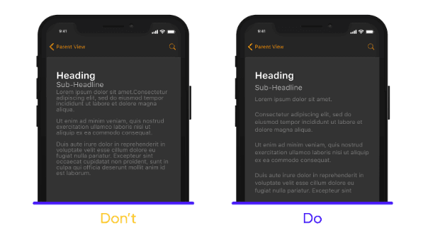 Image source: https://dribbble.com/stories/2020/05/12/8-mobile-design-tips
2.2 Design finger-friendly tap-targets
Smaller touch targets and buttons make the user experience as difficult and inconvenient as ever. To avoid mistaken taps, you need to create a suitable size for all interactive elements to ensure they're easy for users to tap.
Practical recommendations:
- Create controls that measure at least 7 - 10 mm so they can be accurately tapped with a finger.
 Image source: https://xd.adobe.com/ideas/principles/app-design/10-dos-donts-mobile-app-design/
- Ensure enough spacing between tap buttons.
2.3 Cut out the clutter
You usually overload users with excessive functionality and unnecessary information. Your mobile interface becomes overloaded, messy, and complicated. User experience is negatively affected. Remember that the key to success is simplicity, reducing clutter will improve comprehension, especially with smartphone screens with a limited size. So let's get rid of anything in a mobile design that isn’t necessary.
Practical recommendations:
- Strive for minimalism. Avoiding information overload by providing content that is valuable for your user experience and removing all unnecessary elements.
 Image source: https://lvivity.com/mobile-ux-design-best-practices
- Prioritize one primary action per screen.
If you cannot limit the functionality, use the simple rule of “one action - one screen”. Design each screen for only one thing related to one action. These interfaces which consist of simple and clear screens are becoming easier to learn and easier to use.
2.4 Create a seamless experience
In the Internet-access world, users rarely use only one device. Education, work, and entertainment will be performed well with the support of smart devices. Users can use relevant apps on a smartphone, then switch to a tablet, a personal computer, or a desktop and vice versa. It’s essential to offer a quality seamless experience across all devices for the end-user.
Practical recommendation:
- Synchronize a user’s current progress. This way helps users save a lot of time and be more satisfied with their experience. Offer the ability to automatically synchronize in different devices when users want to switch. Users can easily continue experiencing from anywhere they stopped on mobile.
2.5 Navigation must be simple
Offering simple and intuitive navigation is one of the important steps. It ensures that the end-user finds and utilizes the functionalities that your mobile app provides. Moreover, navigation can encourage users to engage and interact with the content frequently. In the small screen of mobile devices, the navigation menu must be designed with a suitable size to ensure that it does not take up too much screen space.
Practical recommendations:
- Make sure that navigation is familiar to users. Use navigation patterns that are familiar to your target audience. Easy-to-understand navigations make the user experience comfortable and happier.
- Reduce search effort.
If a search is a key function of your app, it needs to be in front of people. Either display it at the top of the screen or have a visible reference that activates search mode.
- Communicate current location. Using location indicators, users know where they are in your app so they can navigate successfully.
- Strive for consistency. Don’t move navigation controls to a new location or hide them on different pages. This will confuse and disorient your users.
2.6 Design for one-handed use
Research shows that approximately half of mobile users hold and use their smartphones with one hand, mostly the thumb. So you need a tailored interface that allows users to interact with crucial features with just one hand easily. You can offer left-right swiping, a popover window, or a tab bar in your design.
Practical recommendations:
- Expand screen sizes to increase accessibility if possible.
- Place the top-level menu, crucial controls, and common action items in the green zone of the screen to ensure easily reached with one thumb.
- Place unnecessary actions in the hard-to-reach red zone to avoid tapping them accidentally.
2.7 Thoughtful and timely notifications
UX design also needs space for notifications. It permits your application to communicate with the end-user in real time. If you can send valuable information promptly, user retention will improve significantly.
Practical recommendations:
- Use different message types. There are many ways to interact with the end-user through messaging. For example, push notifications, email, in-app notifications, and news feed updates. You can combine them to create a great user experience.
- Think twice before sending a message. To avoid disturbing your users, you never send useless annoying notifications. Because this is the main reason most people uninstall mobile apps.
- Send personalized messaging to inspire and make users satisfied.
2.8 Provide feedback on interactions
You should provide visual feedback in response to every user action. Doing this helps users know what an app is doing now and how the app interacts with them in real time. Feedback is the evidence to show that your app has been processing the requirements of the user.
Practical recommendation: Depending on the type of UI element or the current state of the app, designers can use different forms of feedback. For example, highlight interactive elements when tapped, send progress indicators to notify the status of long-running operations, and make the results of operations clear by using animated effects.
Conclusion
Here are the top 8 practices to help you in designing UX for mobile apps. UX design for each mobile app is always an exciting challenge. This requires not only the design team but also other development teams to work together perfectly. However, the overwhelming benefits of the best UX design for your mobile apps are endless. Let’s take advantage of this to gain more and more achievement.